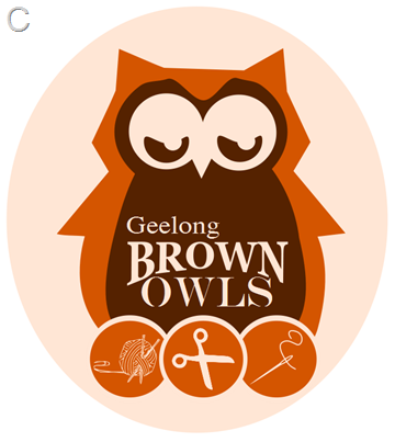
The lovely lady with whom I am discussing the Geelong Brown Owls with, upon visiting my blog, suggested I might want to draw a logo for the group. I love a project (in fact, it’s almost the only way to get me to do anything…) so of course I agreed, but I decided that I wanted to do a “proper” logo, something a bit slicker than one of my drawings would be, & have been playing around in Inkscape.
I still think I am an absolute beginner with this program & don’t want to tell you how long it took me to get to this stage via various tutorials & helpful tips, but I would like to know what you think of these?
Which do you prefer (I won’t tell you my favourite)? I was going for a retro vibe, but not being a Graphic Designer I’m not sure if I’ve done enough or too much or am on the completely wrong track altogether!
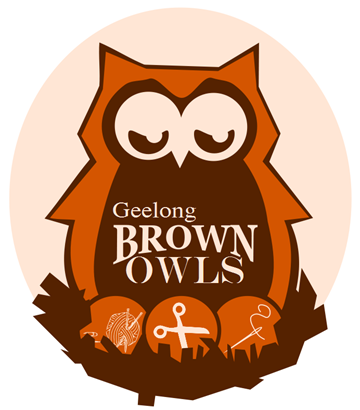
:: I listened to Nic (She IS an expert after all) & although I had tried the thick outline with the beige oval last night, I didn’t really like it. Tried again this morning with fresh eyes & was happier, but had to add something… so below is yet another option. I like it! ::


Excellent work - I love Inkscape!!
ReplyDeleteI vote for C .... but ... if you were up for edits, I would do A with a beige circle around it like C has cos I like the dark brown shaddowy effect on the owl more in A.
I adore all of these.I think C is my favorite.
ReplyDeleteI'm going to have to check out inkscape.
C too, very cute!
ReplyDeletei like a or c
ReplyDeletejanine
C for me too, but I do like Nic's suggestion.
ReplyDeleteI really like B.
ReplyDeleteAll very nice but I think I would have to go with A.
ReplyDeleteI like D the best!
ReplyDeleteLove them, Vic. A is my fave with C not far behind.
ReplyDeleteI think C. Nice work.
ReplyDeleteYep, "c" fo me but they're all great.
ReplyDeleteI like D the best as I like the brown outline but the scissors in the centre keep saying "snip" and I'm not sure about their placement.... Cherrie
ReplyDeleteLove it - I think the nest is the perfect touch.
ReplyDeleteFirst one is my favorite.
ReplyDeleteI vote for C as well....very well done..and very cute...cheers
ReplyDeleteI like the last one , with the nest.x
ReplyDeleteI like the last one too. A Mama owl with her crafty eggs in her nest. Sweet sweet sweet.
ReplyDeleteYou have done an excellent job, especially for someone who considers themselves to be a novice at these things. :)
It's "A" or "C" for me! Well done, these are amazing - and I'd keep the "not a graphic designer" thing quiet, noone would ever know!!
ReplyDeleteI like C the best
ReplyDeleteNow that I see them all together - the last one is THE BOMB - excellent work. I would be proud to wear that badge! Nic x
ReplyDeleteA or C for me. I like the concept of the nest but the others win on simplicity.
ReplyDeleteEgg shapes instead of circles?
ReplyDeleteBut really, they're all great.
Ooh, that's a tough one, but it seems to be A that grabs me.
ReplyDeleteC! Definitely! :) Good job!
ReplyDeleteI would say 'A', assuming it doesn't have a set background, because then it could go on anything.... i.e. add a branch for stationery, etc., or sit in the crest of the moon, etc.,...you did ask...lol... :) Happy crafting, Jenny
ReplyDeleteLove your sweet little owls! Clever girl! I must investigate inkscape!! Thank you so much for my gorgeous little sausage dog bunt - love love love it!
ReplyDeletei like the second one the best. I feel like the last one is a bit busy. I like the three images a bit larger and outside the owl. What a cute concept!
ReplyDeleteI stumbled upon your blog and just wanted to say hi!
come on over and visit!
colorissue.blogpsot.com
xoxox,
Aarean
I vote for C - can wait to hear your decision
ReplyDeleteLisa
I think you're really clever! I like C the best!
ReplyDeleteLove tham! You're a genius ... I'd love to be able to do that ... I'm envious :) Well done!
ReplyDeletewow, awesome work! I like A with a beige circle.
ReplyDelete